Groundbreaking UI
The interfaces I designed for the Halo franchise have been praised by fans, borrowed by others, and influenced the feature set we recognize today as standard console platform operating system features. The console user interfaces I created in the Halo were the first to
- Allow people to form parties and move together between game sessions as a group
- Have an always-present active roster that allowed players to navigate the UI and stay together in their party
- Have a friends list viewable in-game
- Allow friends and clan to send messages without exiting the game
- Feature a virtual keyboard accessible in-game
- Display player details and status in-game
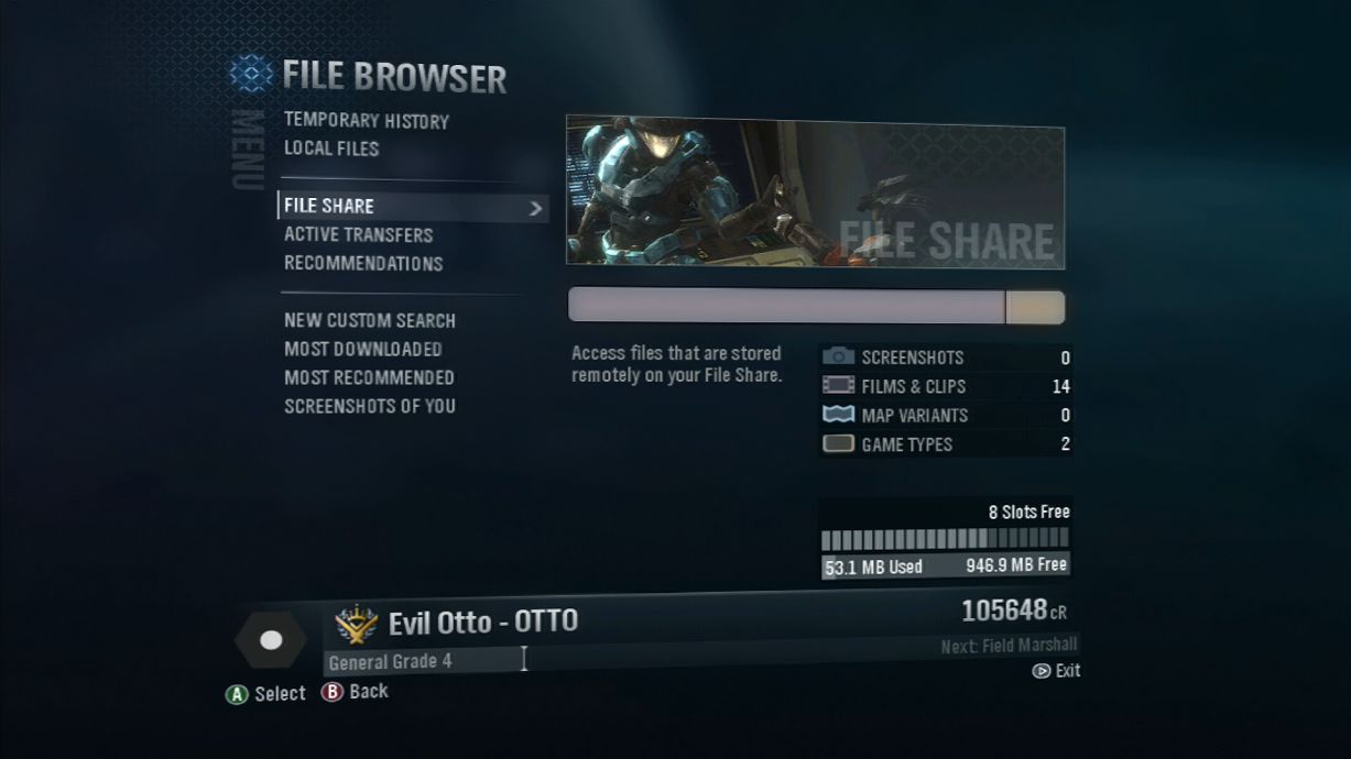
- Enable cloud storage and a file browser for saved game content
Take a look at the final product...
The Fast Path
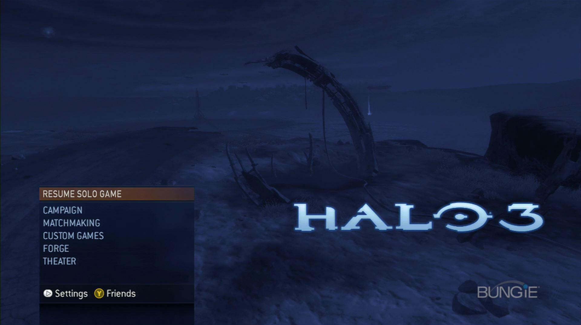
The main menu of the latter Halo games featured a contextual 'fast path' option that remembered what you were doing the last time you were on, and shortcut you straight into the mode. This allowed players to get right back into the action with a single button press.
Moving Concept Art
For the Halo reach backgrounds, I wanted to feature exciting scenes from the game, but keep load times and production costs to a minimum. A concept artist provided us with layered Photoshop files. I put the layers on cards and looped the camera around the environment to allow the game to create depth and motion through parallax.
HaloOS
One of the most involved UI features I ever had to design for was the file browser in Reach. It supported robust searching, local and cloud based content, file types, downloads, recommendations, deletion, notifications, and storage limitations. Essentially, we created an operating system within a game that could fit on a Standard-Def CRT and navigated via a console controller.
Not Just Decoration
The subtle framing in the Halo 3 HUD served for more than just to unify the elements. When the player needed to reload or take cover, it allowed me to crank up the player's peripheral acuity with large flashing areas of contrast, that felt more like a natural effect of the light on the visor than a gaudy typical outer glow.
Splitscreen Sign-In
It always bothered me when I played a splitscreen game and got assigned a quadrant that was on the other side of the TV from where I was sitting. In Halo 2, I designed the login screen to not only allow players to assign the right profile to the right controller, but also let them determine their quadrant before the game launched.
Halo 3 Lobbies
In Halo 3 we wanted to allow parties to not only be able to participate in all activities together, but stay intact as they changed modes. With the switch lobby functionality, the party leader could change the activity type and options at will while preserving the party roster on the right.


