Home // Halo // Design Docs // Halo 3 HUD Spec
Forerunners HUD Specification
Overview
2.1 Scope
The HUD will be will be available to players in both campaign and multiplayer modes. This document covers the core following as relates to the HUD:
• Visuals
• Animations
• Behaviors
• Tools
• Supported resolutions
2.2 Related Specs
1. The respawning and camera switching behaviors are outlined in the following multiplayer documents. It can be found in source depot:
a. //main/design/Multiplayer/ingame/Voluntary Respawning.doc
b. //main/design/Multiplayer/ingame/Dead Cam.doc
2. A messaging spec is owned by the multiplayer team and outlines messaging behavior:
a. //main/ design/Multiplayer/Drafts/HUD - Messaging.doc
2.2.1 Linked Files
To further illustrate behaviors, some features have an associated reference video with them. These use relative target URLs, so as long as you are viewing this document from its depot location and you have latest, the links should work.
2.3 Summary
The goal for the HUD is to provide players feedback about their current situation. The HUD acts as the player’s dashboard indicating inventory status and any immediate influencing factors nearby.
2.3.1 Document Goals
- The goal of this document is to outline the plan for HUD functionality, design and appearance.
- The goal of this document is also to give the developers documentation that they can refer to when building the features for the HUD.
2.3.2 Document Non-goals
- While this document does cover all the features we have planned for the Halo 3 HUD, some visuals are not in their final form.
- This document does not go into detail about Campaign or Multiplayer features, just how the HUD interacts with them. In cases where the feature needs to be fully understood, a link to the appropriate spec is referenced.
- Visuals are not final. Although some visuals are shown in examples, they are placeholder only until we have nailed down the feature list.
Multiple Resolution Support
1.1 Full resolution support:
In Halo 3, we plan to support both regular and HD televisions. This means that the HUD must be drawn in 3 different screen resolutions and their respective split-screen modes. Pixel dimensions we plan to support are listed below from smallest to largest:
It can be safely said that we don’t want to have to author exact pixel coordinates for each and every HUD bitmap in each resolution. As we have done in the past, the HUD should support anchor-point alignment with a pixel offset rather than any kind of x, y pixel coordinate alignment. We’d like to continue support for the anchor points in the 4 corners and the center.
Because widescreen modes are so wide, we didn’t split the screen horizontally in Halo 2, but vertically. Unfortunately, because this made the splitscreen format tall instead of wide, players didn’t care for it much either. In Halo 3, the plan is to pillarbox widescreen modes in split-screen situations so they aren’t so wide and then split them horizontally. In 480p, we want to set the used screen width to 640 pixels in half-screen, and in 720p, we want to only use 960 pixels in width for half-screen. This caps the proportion at 8:3 (640x480 half screen) – which is about as wide as we want to go. These dimensions are reflected in the above chart.
Multiple Element Support:
Of course, the HUD elements that we draw in the 720p fullscreen mode simply will not fit into the 480i quarter screen dimensions. Since we are already scaling the frame buffer, all HUD bitmaps are being scaled anyway, so the solution that makes the most sense is to author the HUD bitmaps at high resolution and scale them dynamically based on designer-defined values in the HUD globals.
In some cases, though, simply scaling the bitmap may not work and a replacement may be required –or no bitmap at all. For example, in Halo 2, we hid the scoreboard meters entirely to conserve space. In Halo 1, we used much skinnier bitmaps for shields and energy weapons to conserve space. We should then have an exception block within each element block to accommodate for these.

In this example, the exception pulldown gets its name from the selected override resolution. This allows independent control of elements for resolution tweaks.
Directional Damage Indicators
1.1 Player feedback:
In Halo 3, we plan to build a system that addresses the shortcomings of the damage indicators in Halo 1 and the lack of them in Halo 2.
In Halo 3, we need a system that addresses these issues. The system is a two-part indication system. One system helps the player find the threat and retaliate. The other gives the player feedback about how and where they took damage.
1.2 damage impact flashes
In Halo 2, when the player took damage, we flashed the screen blue for shield damage and red for health damage. In Halo 3, we want to show the player the flashes, but rather than encompass the whole screen, the flash is a large gradient that indicates the direction that the damage came from. Within your field of view, the center of the gradient is centered on the point of impact.

These radial gradients will have the same opacity and duration as the screen flashes in Halo 2, however, they track the damage, so, for instance, if the player took an impact on the right side of his visor and turned to the right to face the impact, the gradient would move to the center of the screen.
If the impact from damage is outside the player’s FOV, the gradient is indicated in the periphery of the screen. For the majority of cases, where an opponent is firing at the player from the same height, this will appear on the left or right of the screen, whichever is the least amount of distance to turn to face. In cases where the player takes damage from above, outside the FOV, the gradient will appear along the top edge of the screen. Likewise, if the damage comes from below, it would appear along the bottom edge. The gradient also has a grid-like alpha so it appears more like a HUD element than a weapon effect.
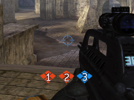
1.3 Threat Indication:
The threat indicators are little red arrows that point in the direction of the player that is shooting/throwing grenades at you. The arrows are indicated on a plane the circles the crosshair. The perspective has two fortunate results – first, threat from behind is indicated much clearer and larger and grabs your attention, while the forward arrows are less intrusive. Second, it is made clearer to the player that the arrows indicate forward and back rather than up & down like traditional indicators of this nature.

As they did in Halo 1, the arrows only show up briefly, about 1 second per hit, before fading out over a half-second. Like the dots in the motion tracker, the arrows move in tandem with your relative position towards the enemy shooting you. Because most of the time that your damage is coming from in front of you at the 12:00 position, the player is often aware of the source of that damage. Therefore, to reduce unnecessary clutter, the cone of vision will partially alpha out the arrows within the viewable plane. Imagine if the image below was an alpha mask for the circle of the damage indicators. As the arrow nears the front center, it dims. At the true 12:00 position, the arrow’s alpha only hits 40% of its standard opacity. The amount of dimming and the region need to be able to be tweaked by the designer.

We had considered hiding the arrow altogether at this point but doing so only implied that the threat was gone and that any other damage from other sources became a higher priority. We do, however, want to indicate the shortest direction to take to turn to the person shooting you from behind. We would like the arrow to avoid the 6:00 position as much as possible. This way we avoid making people guess the quickest way to turn and they don’t see the arrow and think it is pointing down. The behavior, then, is that when the enemy is anywhere between the 7:30 and 4:30 positions, that we gravitate the indicator to either one or the other. If the player spins around and passes through the 6:00 area, the transition is quick and it gravitates to either the 4:30 or 7:30 position.
More than one arrow at a time may be shown, depending on however many people are currently shooting at you. In theory, the feedback the user gets is much like an arrow twirling on a transparent card that points like a compass to the source of the opponent. Although this might be able to be engineered without mapping the arrows to a card in order to get a simulated perspective, the desired effect is the same.

We should also indicate the direction of an opponent that is firing directly at you even if they aren’t hitting you. This includes lighting up the indicator when an opponent’s grenade is tossed within the player’s damage radius. Although the technical implementation is beyond the scope of this spec, I would suggest this could be as simple as the client specifying that the shooter’s reticule is red when the trigger was pulled even though the autoaim’s variance resulted in a miss. However, detection of near-misses would be optimal. We should never point at a nearby enemy that is firing in another direction.
Threat indication is used in concert with the radial gradient damage screen flashes to reinforce which kind of damage you are taking (blue=shield, red=health, just like it was in Halo 2) and from which direction.
Note that the threat and damage may not always indicate the same direction. For instance, if a person to your right fires a rocket and hits the ground to your left, the damage flash will appear in the lower left corner, while the arrow will point to the right at the guy that shot it.
Equipment
5.1 Equipment
In Forerunners, there is a new feature that allows the player to carry around a special power-up, that we’re calling equipment. When a player has equipment, it is stowed away and not brought out until it is used. Because of this, the player needs some kind of indication that they have the equipment, and what it is.
In addition, the player also has one more piece of stowed gear, and that is their secondary weapon. If the player picks up the flag, a ball, a bomb, or an uber weapon, then they have three stowed items. To indicate this information, we will give the player a piece of UI in the HUD that displays their inventory.

When there is no item stowed in inventory, the inventory field doesn’t show up at all. (a.)
If a piece of equipment or a stowed weapon is in the inventory, then the inventory field comes up (c.) and items then stack in it using similar bitmaps to the halo 2 backpack weapon over the field (d and e)
If a secondary weapon is picked up in the player’s left hand, then the inventory pushes down to accommodate for space (b.)
In split-screen situations on 480i or 480p, the field is removed and only the icons show. There are 16 different pieces of equipment and 3 categories:
Modes
- Invisibility Mode
- Invincibility Mode
Gizmos
- Jammer Gizmo
- Scout Gizmo
- Power Drain Gizmo
- Smoke Bomb
- Bubble Shield Gizmo
Gear
- Tripmine
- Automatic Turret
- Pocket Grav-lift
- Instant Wall
Messaging
6.1 Messaging
The messaging system in Halo 1 and 2 was a bit cumbersome. At times, the player could be inundated with up to 6 lines of text drawing on the screen at any given time. The problem is, that there was very little hierarchy. Weapon pickup messages were always on top, and then all event messages were listed below in order of appearance. One of the problems with this is that you could have ammo and grenade pickup messages push down certain major events like medals and kill messages. Also, all this messaging could get overwhelming and just come across as white noise that was interfering with your view. Although much can be done to reduce the messaging and make it more efficient, that is the subject for the messaging behavioral spec, which is maintained by the Multiplayer team, the bulk of which is beyond the scope of this one. However, the solutions via information design and layout are covered in this document below.
As far as font rendering goes, we would like to use the same font outlining that we have in the shell UI, yet also have the ability to turn that off in some cases.
6.2 Draw-In
In previous games, messages simply popped in and faded away. Although it wasn’t elegant, it did the job. There are things we can do to make the messaging slicker, however, we don’t want to get too crazy. The animation sequence involves briefly having a bitmap flash where the line is to draw and scale the text in while animating from pure white to the blue tint. The text outlines should also fade in as well, so the borders aren’t drawing initially.
6.3 Medals:
Medals are now no longer embedded in the font. This allows us to animate medals independently and draw them larger. In the messaging example movie above, the medals appear and disappear in sync with the text message they represent, however, the medals queue from left to right instead of top to bottom showing up to four at a time. The animation in is similar to the text message in that it scales up, however the burst of light happens after it is done scaling rather than before. Also, there is a bit of a spin as it draws in.

6.4 Making room.
Each event-based message lingers on the screen for 1 second. After which, it decays by fading its alpha over another second and a half of time. When a new message appears, if there is a line of text already occupying the top line, then that line moves down in an animated push. These animations take no more than 100ms. We want these to feel very responsive and snappy. The hard limit for lines of copy on the top is 4.
6.5 Organizing relevant text:
To keep the messaging concise and relevant to your situation, all messaging has been subdivided into various sections rather than lumping everything into one big blob of text. When the blob gets big, crucial messages can get lost in the shuffle. For details about how these behave, see the HUD messaging Spec.
6.6 Interact messages.
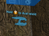
The largest, and thus most cluttering blocks of text is the 2-line dual wielding pickup message. We want these to read quicker. For all interact items (weapon pickups, boarding craft, objectives, and other things that require holding the X button) The item should appear on your right just below the right equipment channel.

Dual wieldable weapon pickup messages appear just below the left equipment channel.
Although we can’t make the font any smaller than it already is in quarter-screen resolutions, we can have a special font with reduced weapon schematics that could cut the extra size that a weapon schematic takes up. We also want to make sure that we continue support for the pickup message brighten/scale effect that we put in Halo 2. We want to add an additive effect with a bitmap burst of light as it comes in (see Kudos below).
6.7 Ammo Pickup messaging.
As you pick up items, the HUD will indicate this visually rather than wholly relying on lines of text to indicate this. The fashion in which these appear are similar to the point multipliers you see in a typical side-scroller at the end of a level, or the Kudos you get in-game in Project Gotham. Although the animation may be tweaked, the general principle behind it is that when you add items to your inventory, a very fast ticker counts the number forward until it reaches the new number in the HUD. The numbers are applied additively, have no dark outline and transition from a large overlap to its space at normal size. See how it works in the following example: kudos.mov Ammo pickups for stowed weapons happen next to the stowed weapon in the inventory.

6.8 Split-screen messaging.
In 480 resolutions, we have a limited amount of space in split-screen, with a usable 260 vertical pixels. Because of this, all ammo pickup messages should be turned off. In addition, the events log needs to be limited to 1 line instead of the four in fullscreen and larger formats.
Incoming Transmissions
7.1 Campaign briefing channel:
When NPCs are speaking in the campaign missions, HUD elements help identify who is speaking. When a player is in campaign mode, they get a special HUD element to identify speakers. This is an inset picture displaying the NPC from a predefined camera point. A shader effect, the curvature mapping and a subtle bitmap is added to the viewport to help integrate it into the HUD like a pop-up window in the Spartan OS:
The appearance will look like it is part on an integrated OS in the Chief’s HUD and not be reflective of the Main menu UI. Video sizes are as follows:
Split-screen
- 256x144 for 480i/p
- 384x216 for 720p
Fullscreen:
- 320x180 in the 480 resolutions
- 480x270 in 720p
Keep in mind, that although these are large, the mission designers are making sure that the briefing channel will never appear during encounters. The briefing channel will also map to the curvature of the HUD (inner helmet) See 11.1.
Besides showing the briefing channel, we should really convey to the user that now is not the time to be fighting. During briefings, the crosshair should disappear and the gun should get lowered.
See the video of it in action: briefing_channel.mov
7.2 Multiplayer Flashing Name
When a player is in any multiplayer mode, only the name and speaker icon is displayed, as in Halo 2.

Warnings
8.1 Calling attention
The purpose of the Dashlights in Halo 2 were to redundantly call immediate attention to the player that a critical piece of information needs their attention. This was redundant and became an unwritten admission that we weren’t doing a good enough job of calling attention to critical areas of the HUD.
In Halo 3, in place of the dashlights, we want o just do a better job of calling the player’s attention to the HUD element that requires attention, rather than simply having redundant info in the center of the screen.
To do this, we need to have an animation state where the relevant meters (battery, ammo, shields, etc. go into a flashing mode that cycles between two designer-defined colors.
Startup Screen
9.1 Full Screen
At the start of a multiplayer round we want to be a bit more obvious to players about the gametype rules, what their role is and what they need to do – and what team they are on.
Before the HUD initializes into its starting state at the beginning of each round the player is shown a screen that displays the following information:
- If they are on offense or defense – shown via text string and image
- What their team color is – indicated by font color and bitmap color
- Gametype – indicated by gametype icon
- Variant name – indicated with text string
This screen comes up during its initialization animation. The animation tools will be used to help visually integrate these into the HUD initialization animation.
9.2 Split-screen
In half screen mode, the message displays at its full size. In quarter-screen, however, a smaller version is shown with just the offense/defense image shown.
9.3 Gametype messages
In games that are not turn based (like multi-flag CTF, KOTH, Oddball, etc), Offense and defense are not viable options. The most important information at this point is indicating team color and your goal. Here are the enumerated versions of the left field (text is not final):
Slayer:
- slayer icon, player color, “Kill your opponents”
- Slayer icon, team color “Kill the opposing team”
CTF:
- Offense icon, team color “Capture the enemy flag”
- Defense icon, team color, “Defend your flag”
- CTF icon, team color, “Capture the enemy flag”
KOTH:
- King icon, player color/team color, “Control the Hill”
Oddball:
- oddball icon, player color/team color, “Get the ball”
Juggernaut:
- Juggernaut icon, player color, “Kill the Juggernaut”
- Juggernaut icon, player color, “You are the Juggernaut”
Territories:
- Offense icon, team color “Capture the Territories”
- Defense icon, team color, “Defend your Territories”
- Territories icon, team color, “Capture the Territories”
Infection:
- Offense icon, team color “Infect the Humans”
- Defense icon, team color, “Destroy the Zombies”
VIP:
- Offense icon, team color “Kill the enemy VIP”
- Defense icon, team color, “Defend your VIP”
- VIP icon, team color “Kill the enemy VIP”
- VIP icon, team color, “You are the VIP”
Scope Treatments
10.1 Treatments:
Of all things that really can look slick in the HUD, the scopes are probably the place where we can have the most liberty. In addition to new animations, we would like to bring back some of the elements we had in Halo 1 that never made it into Halo 2.
10.2 Flavor items:
When zoomed with the sniper rifles, we should bring back flavor items that give your scope a sense of futuristic technology, much like we had in Halo 1. In addition to Pitch & distance to target, we would like to include wind speed, direction, temperature, gravity, and air pressure. If any of this information is not known to the code, these could be defined by the BSP and the code could randomly fluctuate +/- several values. We also would like to bring back the yaw and pitch lines from the halo 1 sniper rifle.

10.3 Screen Effects:
See screen effects section for details
10.4 Animation:
When the scopes draw in, we would like to utilize the same animation system from the UI in order to ad flair to the zoom animations now that they zoom over time rather than instantaneously. See the following examples for zoom animations, each of which could be achievable with the current animation system and screen effects. (Movies linked in original documentation)
Visual Unification
11.1 Mapping to curvature:
One thing that we can do to really make the HUD feel like a next generation title is to add some dynamic curvature and motion to it. Otherwise, it feels like the typical low-tech static bitmaps that are not part of your Spartan armor system.
After some experiments, simply mapping the HUD to a visor-shaped piece of geometry is a bit too extreme. The geometry should be much more subtle and graceful in form…about the curvature of a contact lens. Not only does it help unify the look of the HUD, but it also makes it feel much more dynamic. To simulate this, the HUD will be mapped to the inside of a sphere. The amount of distortion is controlled by a combination of a Z value of a virtual camera within that sphere and a FOV value in the HUD globals tag for each resolution. This will give a bit of distortion as the grid below suggests:
In addition, would need to set up procedural animations to this effect. Refer to Jaime’s damage effects documentation. Also see 11.3 Movement
11.2 Visor elements:
Another way to unify the elements is to add a bit of the Chief’s visor to the HUD. This would be very subtle. The visor elements are shown below in a much more opaque form to illustrate this better:
This would only display in full-screen modes as the proportions shift for all the various split-screen dimensions.
11.3 Movement:
We would like to add a bit of depth and parallax with the HUD by adding some movement to the HUD. Now we’re probably not going to make it bounce up and down with every step, but in cases where the player is being jostled around, we should have some movement. Examples of these cases would be landing from a high fall, getting hit in the side of the head with a rocket, being hit by a vehicle, using a melee attack, and so on. The simulation is to imagine the Chief’s head moving around within his helmet. Although, logistically, it would be more like your eyes having to play catch-up with your skull. Exaggeration:

To see this in motion, see the prototype video fakery. This will look much more natural when matched to the player’s real shake animations: hud_shake_render.mov
11.4 Static:
At particular events in the game such as massive concussion blasts due to grenades, mortar, or rockets, the visual display behind the HUD may manifest a screen effect that causes noise and warping. See above movie for example.
11.5 Incoming Cortana interference:
Another form of static interference will be much less random and even take the form of Cortana. This will only display in campaign as the Chief receives incoming transmissions.
The mission designers have requested that the quality of the transmission “tunes in” based on player location. Just like you can tune in a radio station from various levels of static, they player should be able to “tune in” the quality of the Cortana transmission so if they stand in the proper location, the signal can get the clearest.
11.6 Shield meter:
The meter behavior is the same as is it was in halo 1 and 2, where there is an initial flash before the meter’s length decays. When the shields regenerate, the meter expands to its full length within the border. If the shields are completely out, the meter field should flash a shader defined red until the regeneration process has begun.
Waypoints / Objectives
12.1 Waypoint effects:
One of the problems with our current waypoint system is that is difficult to tell if the item is in front or behind a base, when the item is below you, and where the item is once you’ve reached the waypoint (such as the oddball in a pile of bodies and guns or a flag against a crate).
One thing is to bring back the distance meter. Not only did it add a more gravy high-tech feel and let players see the counter get smaller as they move in the right direction, but some very meticulous fans used it to map out distances for fan created cartography of the levels. Like multiplayer names, the numerical values should only show up when pointed at it, setting the area of influence much larger than the reticule (about the center 1/8th of the screen). We should also call attention to the object by drawing a border effect over the item. The border should probably not stay on all the time, but only flicker on when the object comes into view (The HUD designer should be able to set the variable length from immediate decay to always on) See video: waypoint_render.mov
As objects get closer or farther away, the waypoint should scale dynamically. However, it should never get smaller than 50% its size or larger than 100%. We’d also like to keep the dynamic arrow scaling that was introduced in Halo 2.
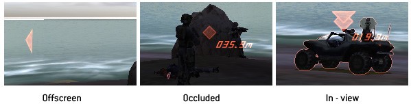
All the above is also true in multiplayer, with the occluded waypoint as a diamond and the in-view waypoint being the objective icon:

12.2 Reset timer meter

As in Halo 2, flags and bombs that have an automatic reset should visually indicate the time to reset via a meter.
Motion Tracker
13.1 In Perspective
A way to give the player a better understanding of the motion tracker is to place it in perspective. Not only does this reinforce in front and behind movement, but it also allows us to take up less vertical real estate in the HUD. As with all other HUD items, it respects the curvature distortion as well. As in our previous 2 games, the Motion tracker should have a ping effect that intermittently emanates from the center of the motion tracker.

13.2 Teammate spawn
When a new teammate spawns on your motion tracker, we want to call attention to it. A “ping” animation plays around that dot to call attention to it. The ping shows 3 concentric circles emanating from that location. See video (note in the video, the dot is red, but instead should be friendly color): ping.mov
13.3 Motion
As dots move around on the tracker, a slight trail follows the dot so players can see better which direction the dots are moving at a quick glance.
In the center of the tracker is a dot that represents you. As in our prior games, t his dot lights up as you move, indicating when you are visible to others on their motion tracker.
The tracker picks up movement above and below the player within their sphere of influence and should not pick up players that are 6-7WU higher or lower than them.
13.4 Waypoints
Waypoints should also be able to show up on the motion tracker when enabled in multiplayer games, and in campaign mode. As in Halo, waypoints render in white. However, instead of being a dot, they should appear as a diamond.
When the waypoint goes beyond the range of the motion tracker, it should appear along the outer edge of the motion tracker and turn into a triangle that faces
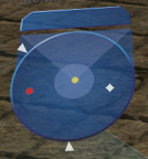
13.5 Colors and shapes
You are indicated as a yellow dot in the center of the tracker. Friends appear as yellow dots. Enemies are red dots. Waypoints are white diamonds inside, white arrows outside.
Vehicles are twice the size as ground troops. Unoccupied moving vehicles should not show up on the motion tracker, giving you a false friend/enemy reading. If a vehicle is a waypoint, the waypoint does not render larger. Infection forms are miniscule dots.
Special Animations
14.1 Coming online:
When a player gains control of his character, either through the game startup, a respawn, or even exiting a vehicle, we want to play a very quick sequence with the HUD objects that implies all systems coming online. This does not occur when starting from a checkpoint – so we aren’t implying any spawning within the fiction.

The animation sequence involves a wiping grid based on the convolution of the visor. View movie to see it in motion: gridwipe.mov
The rest of the HUD draws in with the bitmaps being rendered as outlines. See example: HUD_3D.mov The motion tracker comes in with a scale and a twirl. Although the motion tracker init can be easily achieved with our current animation system, the weapon fields would require some extra lovin to achieve this effect. Possibly some kind of “find outlines over time” shader applied while scaling the bitmaps over time?

14.2 Swapping weapons:
At 10 seconds into the movie above, a sequence involving the UI reacting to a weapon swap is played. Although it shows an example of the fields rotating along the Y axis, we will want transitions to be simpler and quicker. No Y axis animation is needed. The bullets simply slide in and out. While animating the bullets can happen with our current animation system, rotating bitmaps around the Y axis can’t. We would need custom code to put this together or even fake it. An alternative is to map the bitmaps to a card and use the game’s animation system to accomplish this effect.
Screen Effects
15.1 Effects:
Although it has been mentioned before in the sections on HUD shake, directional damage, HUD initialization and scope treatments, we’d like to call out explicitly that we need a system for screen effects. Events that could have an associated screen effect are:
- Concussion hit damage
- Taking hits to shields
- Taking damage
- Overshield powerup
- Invisibility powerup
- Other powerups?
- Zoom scope transition
- HUD initialization
We want to make sure the screen effect system is hooked up properly to the Halo 3 HUD system. This would allow us to hook up cool effects to our HUD system. The current plate of effects are as follows:
- Convolution – for zoomed scope weapons
- Night vision – for scoped weapons
- Motion blur – for zoom transitions
- NTSC filter – for scope effects
Displacement – for scope effects (see Carbine movie. Note the motion behind the bitmaps is displaced and moves at a delay compared to the rest of the scope)
- Color flashes – for damage effects
- Underwater distortion - for under liquid visuals
- Static – for major concussion reaction
- Zig-zag vertical hold - for major concussion reaction (affects HUD only. see hud_shake_render.mov)
Crosshairs
16.1 Standard:
As in Halo 1 and 2, each weapon will have its own crosshair.
16.2 Lock-on:
For weapons with a lock-on mechanism, there needs to be 4 states:
- Standard
- Lockable target
- Locking-on
- Locked
In Halo 2, these animations were hard-coded, but in Halo 3, we would like to be able to incorporate the UI animation system to play animations.
16.3 Map Editor:
See the map editor spec for detailed information on HUD requirements for the map editor. Suffice it to say, we will need to support crosshairs that appear in different modes of editing. See Map editor spec
Mini scoreboard
17.1 Multiplayer Scoreboard:
Halo 3 will display the player scoreboard. The scoreboard consists of 3 main areas; the the progress bars, the score, and the possession marker.

17.1.1 Progress bars
As in Halo 2, the game score progress towards the win condition is displayed in meter form. For team games, the bars are indicated by team color. In free-for-all games, the bars take on the player color and emblem. The game leader is always indicated on top, directly below is a meter indicating you or your team. If you or your team is the game leader, the the 2nd place team or individual is displayed.
When one opponent overtakes the other, an animation plays, swapping the places of the bars.
Progress bars do not display in 640x480 quarter-screen.
1.1.2 Score
The game score’s numerical value is displayed to the left of the meter. In point based games, the value is always a whole number
1.1.3 Possession marker
In games where the objective is possessed by a team or individual, an icon related to that gametype is indicated to the left of the score. This icon would probably have to be embedded in the font and displayed as a character so it properly appends to the properly aligned position (since scores can vary from 1 character to 5 characters).
The marker displays the following for each gametype:
- CTF: Team possessing opponent’s flag. Flag flashes red when being carried, goes solid when dropped.
- KOTH: team/player on hill
- Oddball: team/player with ball
- Juggernaut: player that is juggernaut
17.2 Co-op Scoreboard:
The co-op scoreboard is identical to the multiplayer scoreboard in behavior. However, it does not display the variant name (co-op) or have nay type of possession marker. The scoring only scores enemy kills (slayer rules).
Gametype Specific HUD
18.1 Territory indicators
As in Halo 2, we need to indicate which territories are owned by which team. In Halo 3, however, there will be some slight differences. Each territory will have a unique numerical value associated with it, so teammates can coordinate better.
Capturing behavior is different in Halo 3, as there is no neutral state between captures. Once a flag is owned by a team, it can never go into a neutral state during the capture process. When a territory is being taken, the respective icon for that territory flashes an icon that represents “territory being taken.”
18.2 Capture/Arming meter
In games that require a meter to indicate progress (such as capturing a territory or planting a bomb) a progress meter should appear on-screen as it did in Halo 2. The one difference, though, is that it should render in the color of your team. While the meter is on your screen, a line of text should appear in the alert field indicating the current process. In 640x480 quarter screen the type does not show.
Open Issues
- Does the damage indicator only show after you get hit? Should we let it indicate when you are being shot at?
- Do waypoints show as icons or always outline? Spec indicates current thinking.
- TBD if we allow respawn at selected territory.
- TBD whether or not we will ship with a map editor