Home // Destiny // Design Docs
Destiny Design Documents and Concepts
Part of my work in the design process is putting together prototypes and writing UI documentation. Following are several examples of the early concept work I did on Destiny as we were trying to figure out how these features were going to come together. While the final shipping product changed considerably, there are many ideas and solutions that made their way all the way forward to the final product.
MAtchmaking design spec
This is a design document outlining the UI behavior for matchmaking. After years of experience with matchmaking screens from our days with Halo, the networking engineers, social designers, and I were able to put a solid plan together. The audience for this documentation were the UI engineers, QA team, and content creators, as well as the feature stakeholders.
This is a great example of a very complex feature that was presented in a deceptively simple manner.
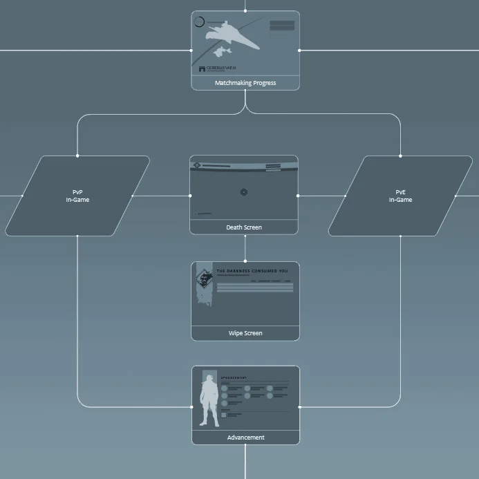
Destiny Flowchart
This flowchart was printed in large format and displayed in a predominant location in the studio. As features and IA were modified, the printout was marked up with a sharpie, pages scribbled out or moved, and comments left in the margins until enough had changed to warrant another revision to the doc.
This physical format allowed not only the UI team, but everyone else in the studio frequently see the current state and structure of the UI as it evolved.
HUD Iterations
Rarely do we ever get anything 100% right on our first try. Destiny's Heads up display was no exception. Some of the iterations came from testing and learning, while others came from upstream changes to the sandbox design.
Another consideration was the Halo factor. How could I make it feel distinctly not Halo while building upon all the lessons I learned during my 10 year stint with that former Bungie franchise? Follow the link and see how it changed during development.


